The Caremaris identity.
Appointments, care, volunteers, and giving. Built around your center.
Carefold pairs an open C with a matching cut in the lettering. Marine ink gives the platform a clear identity; each center keeps its own.
Download the brand kit

Logo and lettering.
Use the complete logo in headers, presentations and correspondence. Reserve the symbol for compact contexts. The letters are outlined, so the logo looks the same without an installed font.
- Keep at least half the symbol’s height clear on every side.
- Use the complete logo at 160 pixels wide or larger.
- Use the optimized symbol at 16 or 32 pixels for browser tabs.
- Keep its proportions and colors. Avoid effects, outlines and rotation.


Color.
- Marine
#183D4ALogo, headings, links and actions
- Copper
#AF6546Restrained accent, not small text
- Chalk
#F8F5EFPage background
- Body
#293F48Reading text
- Muted
#52656CSecondary text
- Tint
#E7EEF0Supporting surfaces
Type and voice.
Source Serif 4 for headings.
DM Sans for body text, labels and controls. The logo combines a custom initial c with outlined Avenir Heavy letterforms. Font software is not included in the kit.
Describe what a team can do: book an appointment, review a visit, fill a shift, or follow up with a family. Keep claims specific and supported.
Each center’s own identity.
Caremaris identifies the platform. A center’s name, logo, colors and documents belong to that center. Caremaris attribution is optional.
Willow’s botanical wordmark and green palette show how a center’s identity carries through the workspace and documents.
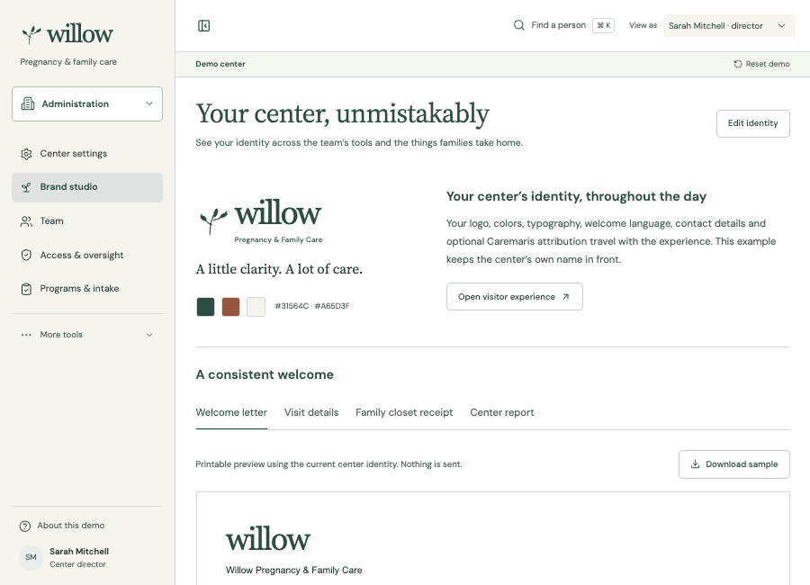
Willow demo